Week 2 seminar – Analysing and Image

7
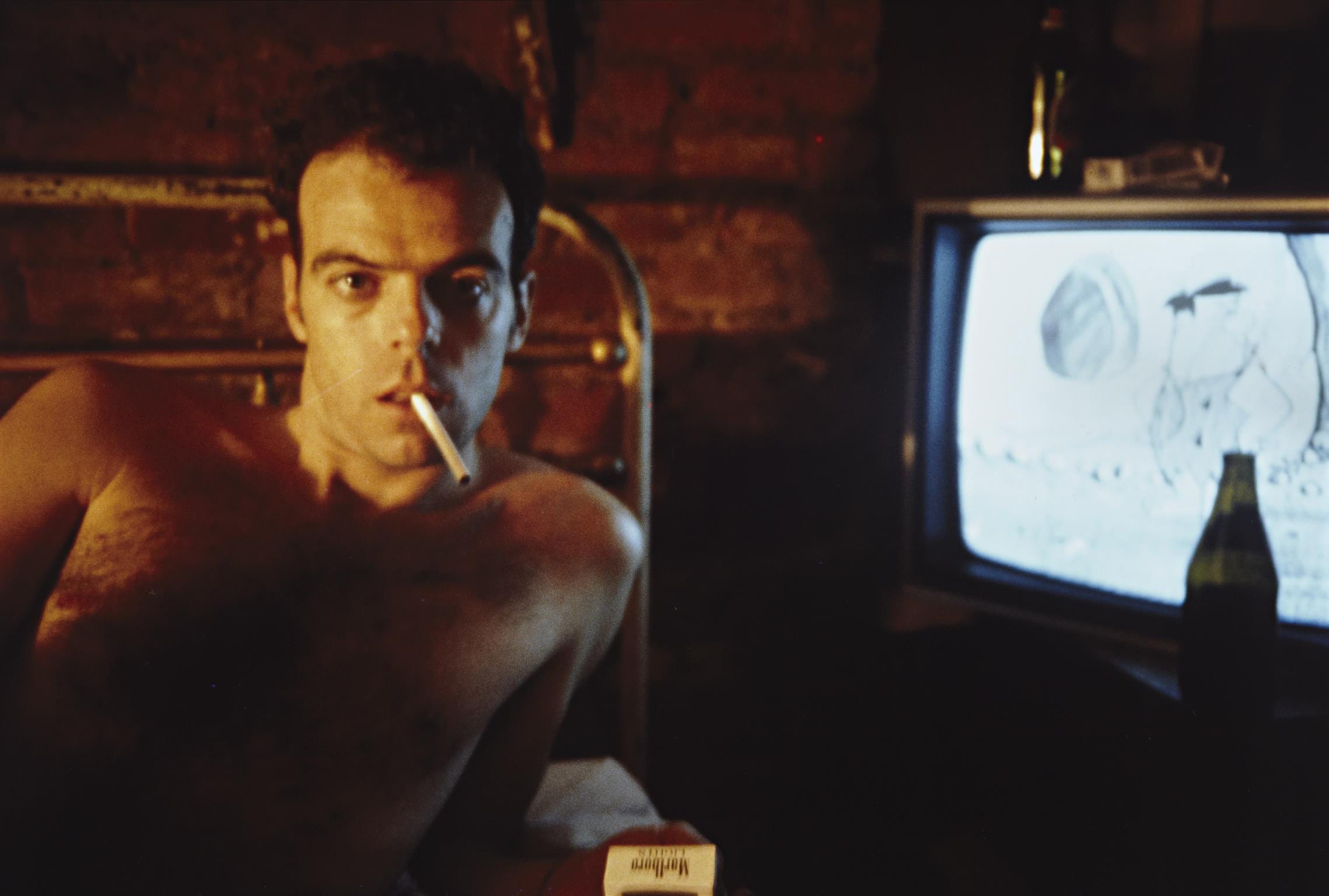
This was the image that I had to analyse.

1. I believe that this image was taken in the 1970’s or the 1980’s due to the style of television in the background and the fact that the image looks as if it came from an advert in a magazine that tries to make smoking look cool, this being less likely to happen recently.

2. The image was likely to have been taken in America due to the ‘Marlboro’ cigarette packet (Marlboro being an American brand), and also due to the style of the mans hair.

3. The key visual elements of this photo are: The man with a cigarette in his mouth, the cigarette packet, the television.

4. The man in the photo is engaging with the photographer by staring directly at the camera sporting a facial expression somewhere between seductive and angry.

5. The photographer probably told the model to look tough and manly.

6. The photographer probably wants the viewer to think that smoking is cool so that sales of the cigarette are driven up.


Photography Week 1 – Appropriation

21981109_396647287416544_3726448543817269248_nDrazil4563 – 2017

This was my favourite image from someone else. The reason I like it so much is because you can’t really tell that this photo was appropriated from someone else and it looks as if this photograph is an original from a portrait shoot. Also this photo could be an advertisement for anything. It doesn’t tell you about what it could be which forces you to think more about what it originally represented which makes it more interesting than other photos.

Photograpy Week 1 – Appropriation

20170928_105359

This is my favourite of the photographs for appropriation that I took. It shows a jacket potato with the word “no” next to it. The reason I like it so much is because by altering the camera angle and utilising the text that was next to the image I was able to alter the message that the original image was promoting. Whereas before the image was being used in a positive manner to promote the food I can manipulate the original meaning of the photo by cutting out the rest of the text and instead just leaving in the word no, which makes it seem as if the image was originally being used in a negative manner.