Project Proposal

Which of the words given in the brief document have you selected, and why?

Division

Which of the words given in the brief document have you selected, and why?

I’m going to do lightpainting, whilst also intersecting portraiture into the photos, allowing me to create distinct and vivid images.

Why are you interested in this subject?

Lightpainting provides a unique and distinct look to any photograph and blending it with portraiture will allow me to create fantastical images.

What do you hope an audience will take from your images?

I hope that they recieve a sense of wonder and bewilderment about how these photos were taken.

What areas of research are you considering to help deepen your understanding of the subject you have chosen?

I am going to be looking into low shutter speed photography and working in low light conditions so that I can consider the best way for the photos to be taken.

What practitioner(s) or visual resources would you consider to have influenced you? This not have to be photographic.

Gjon Mili and Pablo Picasso

Yousuf Karsch

Ansel Adams

What support or equipment might you need to achieve your goals?

Lights, Green screen, Studio, Flashgun
Week 4 – Still Life

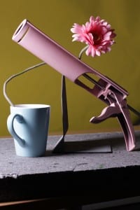
IMG_9042This is my favourite still life photo, the reason being the exposure is just right; the objects are well composed, they fill the frame and the photograph appears balanced. Another thing that I think works really well is that the angle of the light hitting the side of the mug, it lights the objects well without either drowning out the colours and contours whilst not making the photograph seem to dark.

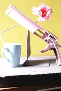
IMG_9043I didn’t like this photo as much as the other one. The framing is just off and a portion of the grout is cut off. The compostion also seems slightly off as well, it seems unbalanced with the left appearing to heavy compared to the right. It is also masssively overexposed. Too much light is hitting the left side and it completely drowns out the colour of the grout, the flower, and the mug. It is also making it difficult to make out shapes such as the mug.

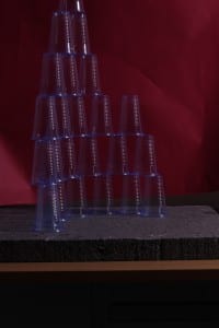
IMG_9038This was another failed attempt of still life that I took. One of the problems being that the cups don’t properly reflect any light and as a result not much can be done with lighting to alter the picture. However the framing almost works if not for the cup on top of the pyramid which is just out of shot.

Week 2 seminar – Analysing and Image

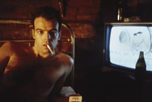
7This was the image that I had to analyse.

1. I believe that this image was taken in the 1970’s or the 1980’s due to the style of television in the background and the fact that the image looks as if it came from an advert in a magazine that tries to make smoking look cool, this being less likely to happen recently.

2. The image was likely to have been taken in America due to the ‘Marlboro’ cigarette packet (Marlboro being an American brand), and also due to the style of the mans hair.

3. The key visual elements of this photo are: The man with a cigarette in his mouth, the cigarette packet, the television.

4. The man in the photo is engaging with the photographer by staring directly at the camera sporting a facial expression somewhere between seductive and angry.

5. The photographer probably told the model to look tough and manly.

6. The photographer probably wants the viewer to think that smoking is cool so that sales of the cigarette are driven up.