 This was the image that I had to analyse.
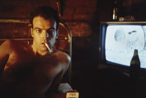
1. I believe that this image was taken in the 1970’s or the 1980’s due to the style of television in the background and the fact that the image looks as if it came from an advert in a magazine that tries to make smoking look cool, this being less likely to happen recently.
2. The image was likely to have been taken in America due to the ‘Marlboro’ cigarette packet (Marlboro being an American brand), and also due to the style of the mans hair.
3. The key visual elements of this photo are: The man with a cigarette in his mouth, the cigarette packet, the television.
4. The man in the photo is engaging with the photographer by staring directly at the camera sporting a facial expression somewhere between seductive and angry.
5. The photographer probably told the model to look tough and manly.
6. The photographer probably wants the viewer to think that smoking is cool so that sales of the cigarette are driven up.