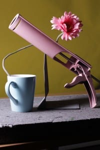
 This is my favourite still life photo, the reason being the exposure is just right; the objects are well composed, they fill the frame and the photograph appears balanced. Another thing that I think works really well is that the angle of the light hitting the side of the mug, it lights the objects well without either drowning out the colours and contours whilst not making the photograph seem to dark.
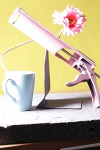
 I didn’t like this photo as much as the other one. The framing is just off and a portion of the grout is cut off. The compostion also seems slightly off as well, it seems unbalanced with the left appearing to heavy compared to the right. It is also masssively overexposed. Too much light is hitting the left side and it completely drowns out the colour of the grout, the flower, and the mug. It is also making it difficult to make out shapes such as the mug.
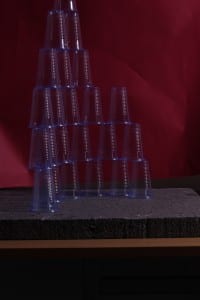
 This was another failed attempt of still life that I took. One of the problems being that the cups don’t properly reflect any light and as a result not much can be done with lighting to alter the picture. However the framing almost works if not for the cup on top of the pyramid which is just out of shot.