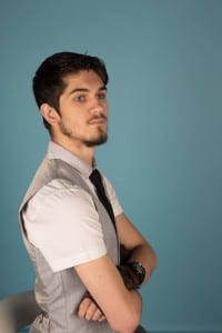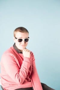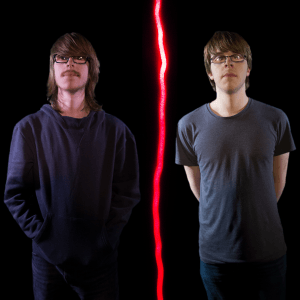
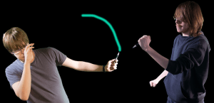
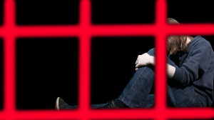
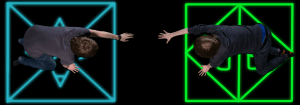
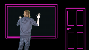
 These are my final five images for the project. What I wanted to do was a mix of light painting and portraiture, mixing action and stillness to create a unique and visually interesting set of photographs. I have used the lights themselves to provide a set for the subject. They tell the story of the photograph and they provide a way for the subjects to interact with each other. Originally, I had planned for the light and the subject to be photographed at the same time, but after technical considerations I decided it would be easier to take photographs individually and then composite them together using photoshop. In the end though I couldn’t use much of the photos of light that I had originally considered using. This is mainly due to not being able to edit the photographs of light into the photos of the models in a realistic and convincing manner; another problem also was not gaining access to a room dark enough which meant light from external sources seeped into the shot. As a result of this many of the light drawings were done using photoshops brush tool.
I am ambivalent about this work. On one hand I believe that the pictures have many merits, however they also have several pitfalls. In terms of composition I believe each photo has been carefully considered and applied. I followed the rule of thirds for each photograph, not allowing the main subject to take up too much space of the frame. Each Photo is also framed correctly, just the right amount of the subject is in the shot allowing for the viewer to understand the meaning behind each photograph without spelling it out for them.
There were however things that I think didn’t go too well. One of them was actually doing the light painting. Several things went wrong with this I felt. The first problem was that I found that I didn’t have a way to do much of the light painting in the same shot as the model and as a result I would have to composite the images on top each other in post-production, significantly raising the amount of time that I would have to work for. The big problem I had with light painting was that I couldn’t find a room dark enough to so that light didn’t seep into the shot. If light from an external source does get into the shot then, the photograph is ruined because then that is also picked up by the camera. Light from external sources is also difficult to edit out of the photograph as it interrupts the black space around the light which is really required to separate it from its background. The final issue with light painting was that when it came to post-production I found that many of the images of light that I took just didn’t fit the images of the models. This meant that in the end I would have to just use the brush tool on photoshop as it was much easier and more effective. Another problem that I seemed to have was with getting a balanced exposure. I think a lot of this had to do with the harsh lighting that I used to light the models, but in the end, it left some parts of the models in some pictures looking over-exposed.
There were a few photographers that inspired me during the creative process of this work. One of them was Gjon Mili who was famous for using low shutter speeds and dark surroundings to combine movement and the still image. To quote: “Mili was a pioneer in the portrayal of movement in photography. Not only did his engineering of photographic lighting tools and techniques in the 1930s change the possibilities for depicting movement, but his photographs themselves altered the public’s general understanding of motion in general.” (International Center of Photography. 2017. Gjon Mili | International Center of Photography. [ONLINE] Available at: https://www.icp.org/browse/archive/constituents/gjon-mili?all/all/all/all/0. [Accessed 08 December 2017].) In his images he would often take photos of a figure in movement, such as a violinist or dancers; he would light the subjects and then using low shutter speeds he could capture every movement that they made. This often left visually mesmerising pictures in which the subject is seen several times, in a different stage of motion. The work of his that inspired me the most however was his collaborative work with Pablo Picasso. Using a flashgun and a torch he got Picasso to paint images in the air and then he would use the flashgun, capturing the artist. What this allows if for the viewer of the image to almost see the way Paints and to see how he works in a still image. It allows for Picasso to be captured in one of his most interesting moments, the moments that he was most famous for. I thought I could use this technique to apply the idea of division, using the light as almost a physical division between the models. In some of my images I have chosen to be very literal with the light physically dividing the subjects from each other. In others I have used the light to form a representation of a division. Division from society, division from wealth, division from each other. Another artist I looked at, due to the quality of his portrait images was Yousuf Karsh who was famous for his photographs of famous figures of the 20th century. Though much of his work has nothing to du with light painting and capturing the subject in motion I find his portraiture alluring and would like to somehow capture that in my photography. His images somehow seem to capture the spirit and soul of the person, dark but balanced lighting helps to emphasise their personality on the image.
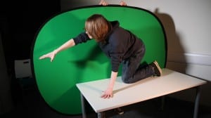 This was one of the photos that I rejected for use in the project. Originally what I wanted to do with this was manipulate the background to make it seem as if he is stuck on an island, and there would be another person in the shot trying to reach towards him. In the end however I decided that this wouldn’t work due to getting the required angles. Another problem with this photo was that his arms are slightly too overexposed which is removing detail that otherwise should have been there.
